Including Asset Share Commons 1.x in your AEM Maven project
Asset Share Commons should always be included as a package dependency in your AEM Maven project. It is not recommended to ever deploy Asset Share Commons source code directly, unless you plan to fork the project entirely - however this likely means you will not be able to enjoy later enhancements or bug fixes.
Prerequisites
Ensure your AEM Maven project follows the latest Maven project structure best practices. This can be create using the latest AEM Project Archetype.
Using with Maven
With any AEM project it is recommended to create a Maven Multimodule project to manage and deploy code and configurations. ACS AEM Lazybones and Maven Archetype 10 are great tools to quickly create the project structure.
Use Maven Bundle Plugin v 3.3.0+
Asset Share Commons uses the latest OSGi annotations. In the <pluginManagement> section of your project’s parent pom.xml ensure that the maven-bundle-plugin is using a version 3.3.0 or higher.
<!-- parent pom.xml -->
...
<build>
	<pluginManagement>
    	<plugins>
    	...
       <plugin>
       	<groupId>org.apache.felix</groupId>
          <artifactId>maven-bundle-plugin</artifactId>
          <version>3.3.0</version>
       </plugin>
       ...
   </pluginManagement>
</build>
Add Asset Share Commons as a Dependency
In the <dependencies> section of your project’s parent pom.xml add this:
<!-- parent pom.xml -->
<dependencies>
	...
	<dependency>
		<groupId>com.adobe.aem.commons</groupId>
  		<artifactId>assetshare.core</artifactId>
  		<version>1.x.x</version>
   		<scope>provided</scope>
 	</dependency>
 	<dependency>
		<groupId>com.adobe.aem.commons</groupId>
		<artifactId>assetshare.ui.apps</artifactId>
  		<version>1.x.x</version>
   		<scope>provided</scope>
   		<type>content-package</type>
	</dependency>
	...
<dependencies>
In the <dependencies> section of your project’s OSGi bundle module (core) pom.xml add this:
<!-- core pom.xml -->
<dependencies>
	...
	<dependency>
		<groupId>com.adobe.aem.commons</groupId>
  		<artifactId>assetshare.core</artifactId>
 	</dependency>
	...
<dependencies>
In the <dependencies> section of your project’s content module (ui.apps) pom.xml add this:
<!-- ui.apps pom.xml -->
<dependencies>
	...
	<dependency>
		<groupId>com.adobe.aem.commons</groupId>
  		<artifactId>assetshare.core</artifactId>
 	</dependency>
 	<dependency>
		<groupId>com.adobe.aem.commons</groupId>
		<artifactId>assetshare.ui.apps</artifactId>
  		<version>1.x.x</version>
	</dependency>
	...
<dependencies>
Add Asset Share Commons as a Sub Package
In the content-package-maven-plugin section of your project’s content module (ui.apps) pom.xml add this:
<!-- ui.apps pom.xml -->
<plugins>
	...
     <plugin>
     	<groupId>com.day.jcr.vault</groupId>
       <artifactId>content-package-maven-plugin</artifactId>
       <extensions>true</extensions>
       <configuration>
       	...
          <subPackages>
          	<subPackage>
             	  <groupId>com.adobe.aem.commons</groupId>
  				  <artifactId>assetshare.ui.apps</artifactId>
               <filter>true</filter>
             </subPackage>
         </subPackages>
         ...
     </configuration>
   </plugin>
   ...
</plugins>
Example POM files
Project Theme Client Library
It is recommended to create a project specific theme to be used to style a project’s Asset Share. Asset Share Commons includes two themes: Light and Dark. It is easiest to choose one of these themes to start, create a copy and then customize. A copy of the theme should be saved beneath the project’s /apps/clientlibs folder. This client library will need to be included in the Page Design for all the templates used in the project.
- Light:
/apps/asset-share-commons/clientlibs/clientlib-theme/semanticui-light - Dark:
/apps/asset-share-commons/clientlibs/clientlib-theme/semanticui-dark
See the Theming page for more details on customizing a theme. See here for a sample clientlib based on Dark Theme. Also see Extend Theme Styles below for a real-world scenario in extending the theme styles.
Customizing the Asset Placeholder
Throughout the Asset Share Commons project a default Asset Placeholder is used if a valid dam:Asset cannot be resolved. This is quite common when authoring Asset Share Commons pages and is useful to preview how metadata/renditions will be rendered. It is recommended to create a project-specific placeholder asset to be used. The Placeholder asset functionality only occurs in the Author environment. In the Publish environment if an Asset can not be resolved a 404 error code will be thrown.
Example Placeholder asset: /apps/asset-share-commons/resources/placeholder.jpeg.
Since the Placeholder assets only get rendered in the Author environment it is ok to save them beneath the project’s /apps folder.
*NOTE the Placeholder Asset should not be confused with a Not Found thumbnail. Several components like the Search Results component and the Image component allow an author to set a Not Found thumbnail to be used if the current asset does not have a valid thumbnail. The Not Found asset must be in the DAM or publicly accessible (should never be beneath /apps).
Customizing Editable Templates
Creating project-specific editable templates is the recommended way of integrating Asset Share Commons into a project. The ui.content package includes examples of the templates and template-types needed under /conf/asset-share-commons/settings/wcm/. *Note that two sets of templates are included in ui.content to support both the Light and Dark theme examples. A project implementation most likely only needs a single set. See for project-specific templates and template types
Template Types
When setting up a new project it is easiest to copy the template types from /conf/asset-share-commons/settings/wcm/template-types in to the project’s /conf folder.
Search Template Type
- Required
sling:resourceType:asset-share-commons/components/structure/search-page- Example in
ui.contentat/conf/asset-share-commons/settings/wcm/template-types/search-page - For Search Pages, includes page properties tab for search configuration.
Asset Details Template Type
- Required
sling:resourceType:asset-share-commons/components/structure/details-page- Example in
ui.contentat/conf/asset-share-commons/settings/wcm/template-types/details-page - For Asset Detail pages, includes page properties tab for detail page configuration.
Empty Template Type
- Required
sling:resourceType:asset-share-commons/components/structure/page- Example in
ui.contentat/conf/asset-share-commons/settings/wcm/template-types/empty-page - For action modal pages, license agreement terms and conditions and any other blank content pages.
Rail Template Type
- (Optional)
sling:resourceType:asset-share-commons/components/structure/page- Example in
ui.contentat/conf/asset-share-commons/settings/wcm/template-types/rail-page - For content pages with a rail that add supporting content to the Asset Share portal.
Templates
Due to the complex structure of Editable Templates it is recommended to create each project specific Template using the Template Editor in the AEM UI.
Templates found beneath /conf/asset-share-commons/settings/wcm/templates should be used as a reference but should NOT be copied directly into a project’s /conf directory.
A Structure policy should be created to include Asset Share Commons - Structure components (Header, Footer, User menu…) on each Template. Allowed Components policies should also be configured based on the template. Lastly the Page Design for each Template needs to be configured to point to a Semantic UI theme client library (preferably a project specific one). [
Search Template
cq:templateType: ` /conf//settings/wcm/template-types/search-page` - example:
/conf/asset-share-commons/settings/wcm/templates/search-template - Structure Policy: Asset Share Commons - Structure, Layout Container
- Allowed Components: Asset Share Commons - Content, Asset Share Commons - Search
Details Template
cq:templateType: ` /conf//settings/wcm/template-types/details-page` - example:
/conf/asset-share-commons/settings/wcm/templates/details-template - Structure Policy: Asset Share Commons - Structure, Layout Container
- Allowed Components: Asset Share Commons - Content, Asset Share Commons - Details
Action Template
cq:templateType: ` /conf//settings/wcm/template-types/empty-page` - example:
/conf/asset-share-commons/settings/wcm/templates/action-template - Structure Policy: Asset Share Commons - Structure, Layout Container
- Allowed Components: Asset Share Commons - Modals
Content Rail Template
cq:templateType: ` /conf//settings/wcm/template-types/rail-page` - example:
/conf/asset-share-commons/settings/wcm/templates/content-rail-template - Structure Policy: Asset Share Commons - Structure, Layout Container
- Allowed Components: Asset Share Commons - Content
Empty Template
cq:templateType: ` /conf//settings/wcm/template-types/empty-page` - example:
/conf/asset-share-commons/settings/wcm/templates/empty-template - Structure Policy: Asset Share Commons - Structure, Layout Container
- Allowed Components: Asset Share Commons - Content
Content
A project specific content structure should be created. At the root of the site, the allowed templates should be configured to allow pages to be created from Project templates. See this project for minimum content structure.
Recommended Content Architecture
/content
     /site-root
           /search-page
                /details (default details page)
                     /image (details for images)
                     /video (details for videos)
                     /document  (details for word documents)
                     /presentation   (details for power point)
                /actions
                     /cart
                     /download
                     /share
                     /license
                /specific-search-page-1
                /specific-search-page-2
More details around the recommended content hierarchy can be found on the Search Page documentation.
Extend Computed Properties
Computed Properties are used throughout Asset Share Commons to display metadata about an individual asset. Implementing a new computed property is one of the easiest ways to extend Asset Share Commons to meet business requirements.
Asset Status - Computed Property
To illustrate the concept of Computed Properties we will be implementing a requirement to show a “New” or “Updated” status indicator if an Asset has been created/modified in the last 7 days. Code snippets below are highlighted to provide additional clarification, the code in full can be found here.
1. Create AssetStatusImpl.java
In your project’s core bundle add a new implementation class named AssetStatusImpl.java. Our new class will extend AbstractComputedProperty.class, an abstract class exposed by Asset Share Commons to make use of several common methods:
@Component(service = ComputedProperty.class)
@Designate(ocd = AssetStatusImpl.Cfg.class)
public class AssetStatusImpl extends AbstractComputedProperty<String> {
...
By extending the AbstractComputedProperty class our new class will implement the com.adobe.aem.commons.assetshare.content.properties.ComputedProperty interface.
2. Add ObjectClassDefinition
Each implementation of a Computed Property needs to provide:
- Name - identifies the Computed Property via a ValueMap
- Label - a human friendly label, used for data source drop downs
- Type - a classification of the computed property. Valid types are
metadata,rendition,url. This is used by data sources to filter which computed properties are shown to a user. A computed property can have multiple types, and custom types can be added.
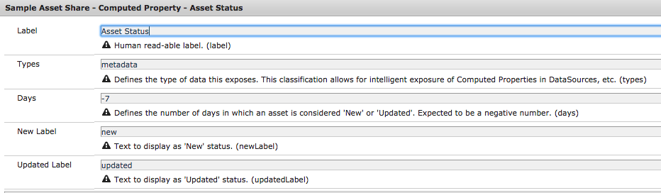
Using the new OSGi annotations we can add an ObjectClassDefinition which will expose the Label and Types as an OSGi Configuration. We will also add a configuration for Days which will determine the period in which an asset is considered “New” or “Updated”, as well as a configurable text for New and Updated labels.
 public static final String LABEL = "Asset Status";
 public static final String NAME = "assetStatus";

 @ObjectClassDefinition(name = "Sample Asset Share - Computed Property - Asset Status")
    public @interface Cfg {
        @AttributeDefinition(
                name = "Label",
                description = "Human read-able label."
        )
        String label() default LABEL;

        @AttributeDefinition(
                name = "Types",
                description = "Defines the type of data this exposes. This classification allows for intelligent exposure of Computed Properties in DataSources, etc."
        )
        String[] types() default {Types.METADATA};

        @AttributeDefinition(
                name = "Days",
                description = "Defines the number of days in which an asset is considered 'New' or 'Updated'. Expected to be a negative number."
        )
        int days() default DEFAULT_DAYS;

        @AttributeDefinition(
                name = "New Label",
                description = "Text to display as 'New' status."
        )
        String newLabel() default DEFAULT_NEW_LABEL;

        @AttributeDefinition(
                name = "Updated Label",
                description = "Text to display as 'Updated' status."
        )
        String updatedLabel() default DEFAULT_UPDATED_LABEL;
    }

    @Override
    public String getName() {
        return NAME;
    }

    @Override
    public String getLabel() {
        return cfg.label();
    }

    @Override
    public String[] getTypes() {
       return cfg.types();
    }

    @Activate
    protected void activate(Cfg cfg) {
        this.cfg = cfg;
    }
The @Activate method ensures that if a change is made via the OSGi configuration the component is updated.
3. Populate getter method
Finally we can populate the get(Asset, SlingHttpServletRequest) method. This is the entry point in which the real “work” of the computed property takes place. The com.day.cq.dam.api.Asset parameter represents the current Asset. SlingHttpServletRequest parameters is the current request (useful for internationalization). We will simply get the jcr:created and jcr:content/jcr:lastModified properties from the current asset and compare them to a date 7 days ago. This will determine the status label returned.
...
    @Override
    public String get(Asset asset, SlingHttpServletRequest request) {

        final ValueMap assetProperties = getAssetProperties(asset);
        Calendar assetCreated = assetProperties.get(JcrConstants.JCR_CREATED, Calendar.class);
        Calendar assetModified = assetProperties.get(JcrConstants.JCR_CONTENT + "/" + JcrConstants.JCR_LASTMODIFIED, Calendar.class);

        //Get a calendar to compare to
        Calendar weekOld = getCompareCalendar(cfg.days());

        if(assetCreated.after(weekOld)) {
            //if asset created < one week ago
            return cfg.newLabel();
        } else if (assetModified.after(weekOld)) {
            //if asset modified < one week ago
            return cfg.updatedLabel();
        }
        return null;
    }

    /***
     *
     * @return a Calendar object to compare asset dates to
     */
    private Calendar getCompareCalendar(int daysOld) {
        Calendar compareCal = Calendar.getInstance();
        // reset hour, minutes, seconds and millis
        compareCal.set(Calendar.HOUR_OF_DAY, 0);
        compareCal.set(Calendar.MINUTE, 0);
        compareCal.set(Calendar.SECOND, 0);
        compareCal.set(Calendar.MILLISECOND, 0);
        compareCal.add(Calendar.DAY_OF_MONTH, daysOld);

        return compareCal;
    }
...
4. Verify deployment of Computed Property
After building and deploying the project, navigate to the OSGi Config manager. The new computed property and OSGi config should be there.
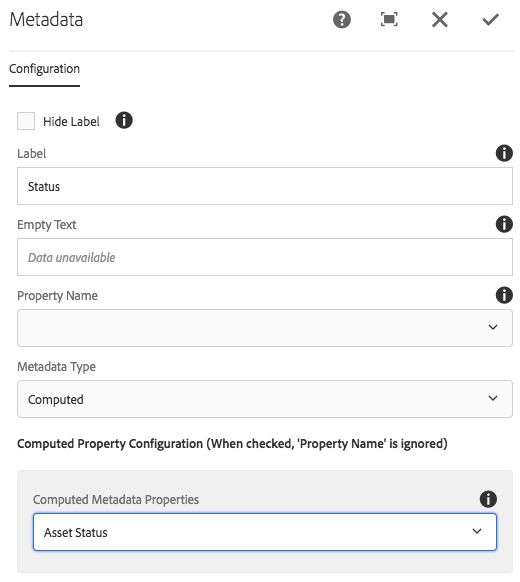
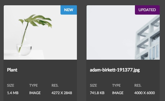
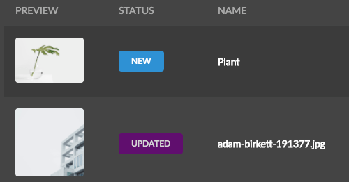
Lastly open up the dialog of a Metadata component on one of the Asset Details pages. The Asset Status should now appear in the Computed Property drop down in the dialog:
Full code sample
Extend Search Results Renderer
Now that we have created a new computed property we want do display the Asset Status in the search results.
1. Create Card and List Result Components
In your project’s /apps/components directory in ui.apps add two new components named card and list.
Card Component
<?xml version="1.0" encoding="UTF-8"?>
<jcr:root xmlns:sling="http://sling.apache.org/jcr/sling/1.0" xmlns:cq="http://www.day.com/jcr/cq/1.0" xmlns:jcr="http://www.jcp.org/jcr/1.0"
    jcr:primaryType="cq:Component"
    jcr:title="Sample Assetshare Cards"
    sling:resourceSuperType="asset-share-commons/components/search/results/result/card"
    componentGroup=".hidden"
    extensionType="asset-share-commons/search/results/result/card"/>
List Component
<?xml version="1.0" encoding="UTF-8"?>
<jcr:root xmlns:sling="http://sling.apache.org/jcr/sling/1.0" xmlns:cq="http://www.day.com/jcr/cq/1.0" xmlns:jcr="http://www.jcp.org/jcr/1.0"
    jcr:primaryType="cq:Component"
    jcr:title="Sample Assetshare List"
    sling:resourceSuperType="asset-share-commons/components/search/results/result/list"
    componentGroup=".hidden"
    extensionType="asset-share-commons/search/results/result/list"/>
The sling:resourceSuperType inherits from the Default Asset Share Commons card and list components. The extensionType ensures the components will appear in the Search Results component dialog. The extensionType must be set on your components in order for the datasource that populates the dialog dropdown to find them.
2. Copy Card and List Template HTL files
Create a folder named templates beneath the card and list components. Copy the HTL template files from the Default Asset Share components beneath the respective components. The structure should look like this:
/apps/sample-assetshare/components/search
			/card
				/templates
					card.html (copied from /apps/asset-share-commons/components/search/results/result/card/templates/card.html)
			/list
				/templates
					list.html (copied from /apps/asset-share-commons/components/search/results/result/list/templates/list.html)
3. Update list.html
Update the header template to add a new column heading for Status after the Preview thumbnail.
<template data-sly-template.header="${@ search}">
	<thead>
		<tr><th class="left aligned">Preview</th>
       <th>${'Status' @i18n}</th>
   ...
Update the row template to add a column to display the Asset Status computed property. Add the column after the image column (second column).
<template data-sly-template.row="${@ asset = result, config = config }">
	...
	<td class="image">
			<a href="${assetDetails.url @ suffix = asset.path}"><img src="${asset.properties['thumbnail'] || properties['missingImage'] @ context = 'attribute'}" alt="${asset.properties['title']}"/></a>
	</td>
	<!--/* Asset Status Computed Property */-->
	 <td><div data-sly-test.status="${asset.properties['assetStatus']}"
        		class="ui status ${status}status label">
        		${status @ i18n}
        </div>
     </td>	...
4. Update card.html
Add a status label on in the card template directly after the img tag inside the article tag.
<template data-sly-template.card="${@ asset = result, config = config }">
	...
      <a class="image cmp-image__wrapper--card" href="${assetDetails.url @ suffix = asset.path}">
            <img src="${asset.properties['thumbnail'] || properties['missingImage'] @ context = 'attribute'}"
                 class="cmp-image--card"
                 alt="${asset.properties['title']}"/>
       </a>
       <div data-sly-test.status="${asset.properties['assetStatus']}"
		     class="ui top right attached status ${status}status label">${status @ i18n}</div>
	...
5. Update Search Results Card and List Renderer
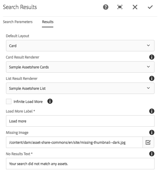
Deploy the new components to AEM. On a Search Results page update the Search Results Component dialog to use the custom Card and List renderers.
You should now see the Asset Status indicator in the search results (for new and updated assets within the last 7 days).
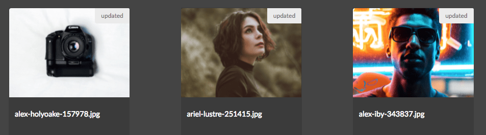
Of course some style changes could be used (especially on Card view).
Full code sample
Extend Theme Styles
LESS and CSS updates should be made in the Semantic UI Theme client library if updating the style for a Semantic UI element (label, card, button, etc…). The Status indicator makes use of the Semantic UI Label elment.
1. Add ‘New’ and ‘Updated’ Color Variables
Add new color variables for @newStatusColor and @updatedStatusColor in your clientlib-theme’s global/theme.variables file. As a best practice it is recommended to place any color variables related to the theme in this file.
Add the following to the bottom of /apps/sample-assetshare/clientlibs/clientlib-theme/semanticui-sample/themes/dark/globals/theme.variables. We can re-use the primary color for the Update status and the New status will be a blue.
...

/* Status Labels */
@newStatusColor : #2185D0;
@updatedStatusColor : @primaryColor;
2. Update label.overrides in theme
The concept of a “Status” label is new, and so add a new rule to label.overrides file beneath the dark theme folder: /apps/sample-assetshare/clientlibs/clientlib-theme/semanticui-sample/themes/dark/elements/label.overrides.
...
/* Status Labels */

/* Uppercase all status */
.ui.status.labels .label,
.ui.status.label {
	text-transform: uppercase;
}

/* New Status */
.ui.status.newstatus.labels .label,
.ui.status.newstatus.label {
  background-color: @newStatusColor !important;
  border-color: @newStatusColor !important;
  color: @white !important;
}

/* Updated Status */
.ui.status.updatedstatus.labels .label,
.ui.status.updatedstatus.label {
  background-color: @updatedStatusColor !important;
  border-color: @updatedStatusColor !important;
  color: @textColor !important;
}
3. Verify Changes
Deploy updates to the clientlibs to AEM. Occasionally LESS are not picked up automatically by AEM client libraries. In order to force an update: delete the clientlib-theme folder benath /var: /var/clientlibs/apps/sample-assetshare/clientlibs/clientlib-theme.
Full Code Samples
Extend Components
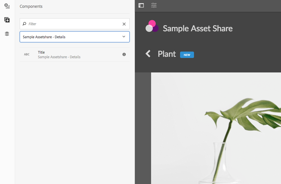
Now that the Status indicator appears in the Search Results it would be nice to display on the Asset Details page as well. Extend the Title details component to display the status on the Asset Details page. Sling resource inheritance is recommended when a change to Component dialog or markup is needed.
1. Create a new Title Component in project
Create a new component in ui.apps beneath /apps/sample-assetshare/components/details:
<?xml version="1.0" encoding="UTF-8"?>
<jcr:root xmlns:sling="http://sling.apache.org/jcr/sling/1.0" xmlns:cq="http://www.day.com/jcr/cq/1.0" xmlns:jcr="http://www.jcp.org/jcr/1.0"
    cq:icon="abc"
    jcr:description="Displays the asset's title."
    jcr:primaryType="cq:Component"
    jcr:title="Title"
    sling:resourceSuperType="asset-share-commons/components/details/title"
    componentGroup="Sample Assetshare - Details"/>
The sling:resourceSuperType will point to the Asset Share Commons version. Since this is a project specific component the componentGroup should be updated for the given project. The jcr:title may also need to be updated if it is confusing to see two Title components in the component browser.
2. Update title.html
Copy the title.html file from asset-share-commons/components/details/title/title.html and paste it beneath the project’s Title component. Only a markup change is required, so no additonal resources need to be copied from Asset Share Commons. Add a label for the status:
<!--/* title.html */-->
	...
   <div class="content">
   		${title.title}
       <div  data-sly-test.status="${asset.properties['assetStatus']}"
		      class="ui mini status ${status}status label">
		     ${status @ i18n}
		</div>
	</div>
	...
Deploy the new Title component to AEM.
3. Update allowed components for Asset Details Template
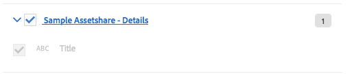
Update the Asset Details template to add the componentGroup Sample Assetshare - Details as allowed components.
- Within the Asset Details template click on the Policy icon for the unlocked layout container in the main column.
- Update the Sample Asset Share - Details policy by checking the
Sample Assetshare - Detailscomponent group.
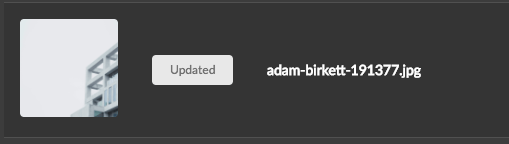
4. Verify Changes
Navigate to an Asset Details page and delete the Asset Share Commons Title component. Add the new Title component to the page. The title component should now display a “New” or “Updated” label based on the Asset Status computed property.