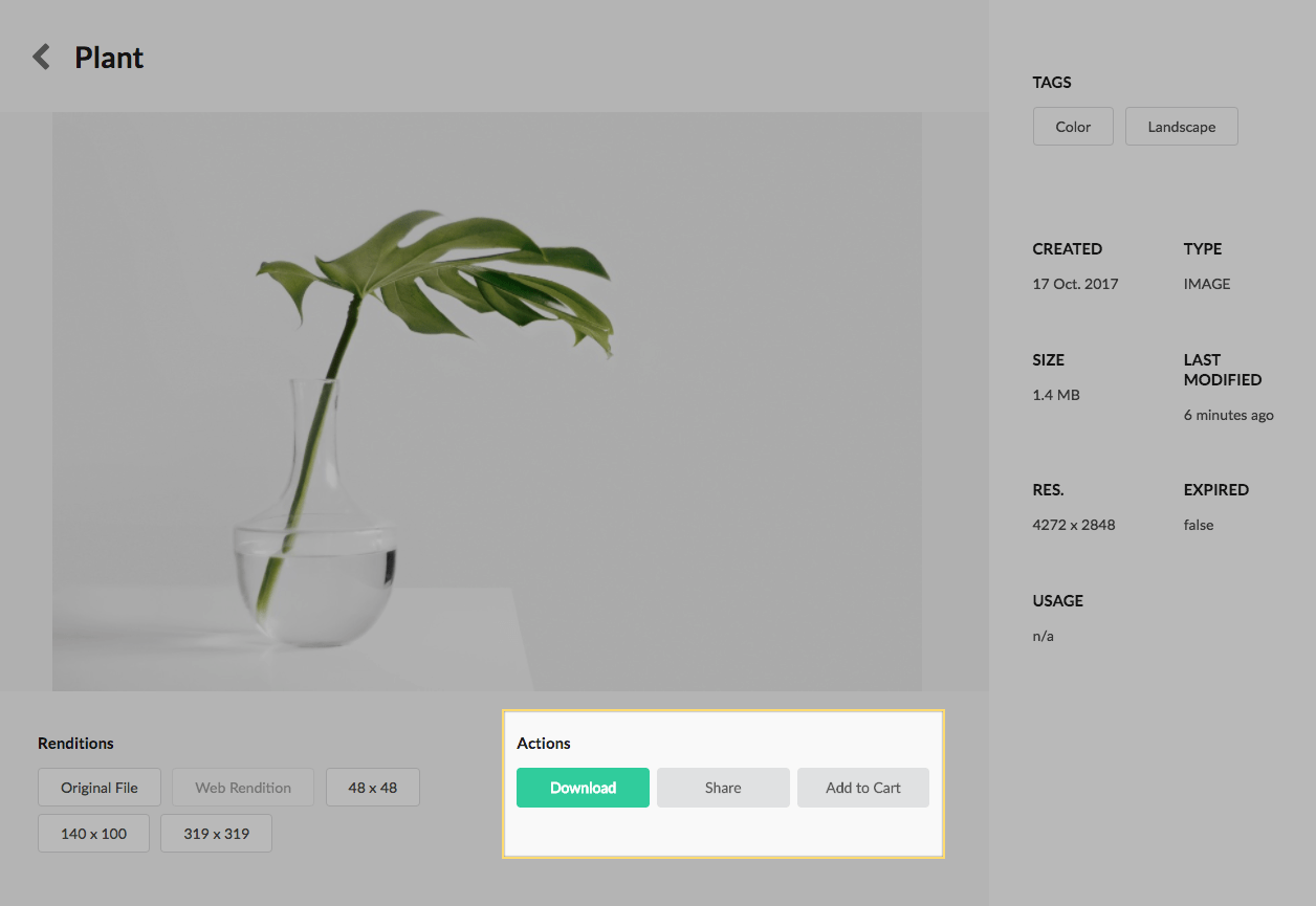
The Actions buttons display the actions that can be performed on the asset. Asset Share Commons 1.0.0 ships 3 actions:
- Download
- Share
- Add to Cart
All actions can be enabled/disabled via the Search Page’s > Page Properties. If an action is disabled, the respective button will not display in this component.
Authoring
Actions can be enabled/disabled via the Search Page’s > Page Properties. If an action is disabled, the respective button will not display in this component.
Setting an action button label to be blank, hides the action button. At least 1 action button must be visible for the component to render.
Dialog / Configuration
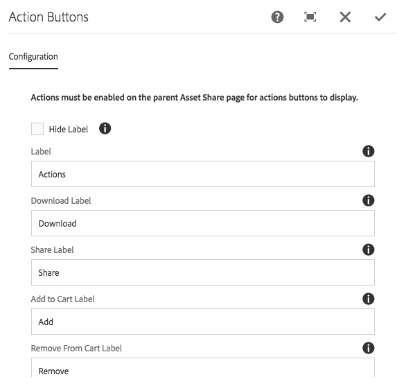
Hide Label
Select to hide the title for the action buttons.
Label
The title (or label) for the action buttons.
Download Label
The button label for the download action button.
- If left blank, this button does not display.
Share Label
The button label for the share action button.
- If left blank, this button does not display.
Add to Cart Label (v1.1.0)
The button label for the add to cart action button.
- If left blank, the cart action button does not display.
Remove from Cart Label (v1.1.0)
The button label for the remove from cart action button.
- If left blank, the cart action button does not display.
Technical details
- Component:
/apps/asset-share-commons/components/details/action-buttons - Sling Model:
com.adobe.aem.commons.assetshare.components.details.impl.ActionButtonsImpl