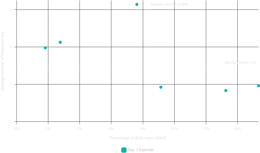
Scatter
The Scatter component is used to display scatter plots. Scatter plots use continuous data for both the x and y axes. They are most useful for comparing two continuous values across many different points.
Encoding
The Scatter component supports many different attributes for mapping data properties to visual representations.
color- Can be a categorical color scale for categorical mappings or a continuous color scale (sequential or divergent) for numerical mappings
lineTypelineWidthopacitysizestroke- Symbol border/stroke color (defaults to
colorif not provided)
- Symbol border/stroke color (defaults to
Examples
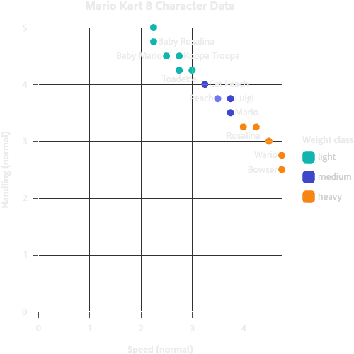
All the following examples will use the same base chart code:
<Chart data={data}>
  <Axis baseline grid position="bottom" ticks title="Speed (normal)" />
  <Axis baseline grid position="left" ticks title="Handling (normal)" />
  <Scatter dimension="speedNormal" metric="handlingNormal" />
  <Legend highlight position="right" title="Weight class" />
  <Title text="Mario Kart 8 Character Data" />
</Chart>
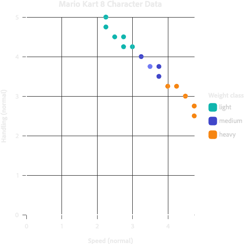
Color
...
    <Scatter {...scatterProps} color="weightClass" />
...

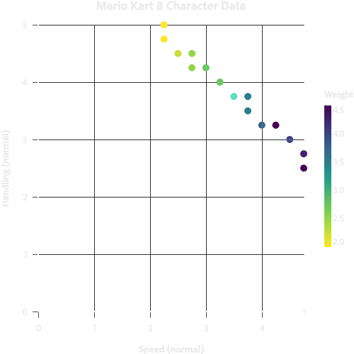
Continuous color scale
...
    <Scatter {...scatterProps} color="weight" colorScaleType="linear" />
...

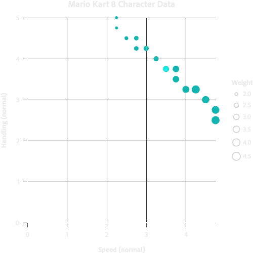
Size
...
    <Scatter {...scatterProps} size="weight" />
...

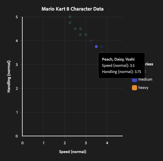
Tooltips and Popovers
Scatter supports ChartTooltip and ChartPopover like all other chart mark components.
Tooltip
<Chart data={data}>
    <Axis
        baseline
        grid
        position="bottom"
        ticks
        title="Speed (normal)"
    />
    <Axis
        baseline
        grid
        position="left"
        ticks
        title="Handling (normal)"
    />
    <Scatter
        dimension="speedNormal"
        metric="handlingNormal"
        color="weightClass"
    >
        <ChartTooltip>
            {
                (item) => (
                    <Content>
                        <Flex direction="column">
                            <div style={{ fontWeight: 'bold' }}>{(item.character as string[]).join(', ')}</div>
                            <div>
                                Speed (normal): {item.speedNormal}
                            </div>
                            <div>
                                Handling (normal): {item.handlingNormal}
                            </div>
                        </Flex>
                    </Content>
                )
            }
        </ChartTooltip>
    </Scatter>
    <Legend
        highlight
        position="right"
        title="Weight class"
    />
    <Title text="Mario Kart 8 Character Data" />
</Chart>

Trendlines
The Trendline component is fully supported by Scatter. To plot a trendline, simply pass the Trendline component into Scatter as a child.

Props
| name | type | default | description |
|---|---|---|---|
| children | ChartTooltip | ChartPopover | Trendline | ScatterAnnotation | – | Optional elements that can be rendered within the chart. |
| blend | 'normal' | Blend | – | CSS blend mode for overlapping points.'normal': Disables blending so points fully cover each other.Other CSS blend mode values (e.g., 'multiply', 'screen', 'overlay'): Applies the specified blend mode.If not provided, defaults to 'multiply' in light mode and 'screen' in dark mode. |
| color | string | {value: ColorValue} | 'series' | Symbol color. If a string is provided, this string is the key in the data that symbols will be grouped into series by. Each unique value for this key in the provided data will map to a color from the color scale. If an object with a value is provided, this will set the color for all symbols. |
| clip | boolean | false | If set to true, inner plot content will be clipped at the plot borders rather than extending into the surrounding space. |
| colorScaleType | 'linear' | 'ordinal' | 'linear' | The scale type for the color scale. If the backing data for color is continuous (non-binned numerical data) then this should be linear which will calculate the color of the point based on the number in the data, using the linear color scale (color gradient).If the backing data is ordinal (ex. string data), then this should be 'ordinal' which will assign colors based on the order of the data passed in. There is no interpolation of color values in ordinal scales. |
| dimension | string | 'datetime' | The key in the data that the metric is trended against. This is the x-axis for a scatter plot. |
| lineType | string | {value: LineType | number[]} | – | Scatter point line type (dasharray). If a string is provided, this string is the key in the data that symbols will be grouped into series by. Each unique value for this key in the provided data will map to a line type from the lineTypes scale. If an object with a value is provided, this will set the line type for all symbols. |
| lineWidth | string | {value: LineWidth | number} | – | Scatter point border line width in pixels. If a string is provided, this string is the key in the data that symbols will be grouped into series by. Each unique value for this key in the provided data will map to a line width from the line widths scale. If an object with a value is provided, this will set the line width for all symbols. |
| onMouseOver | function | – | Callback that will be run when a point is hovered. |
| onMouseOut | function | – | Callback that will be run when a point is no longer hovered. |
| metric | string | 'value' | The key in the data that is used for the value of the data point. this is the y-axis for a scatter plot. |
| name | string | – | Scatter name. Useful for if you need to traverse the chart object to find the scatter plot marks. |
| opacity | string | {value: number} | {value: 1} | If a string is provided, this string is the key in the data that symbols will be grouped into series by. Each unique value for this key in the provided data will map to an opacity from the opacity scale. If an object with a value is provided, this will set the opacity for all symbols. |
| size | string | {value: SymbolSize | number} | {value: 'M'} | Scatter point symbol size. If a string is provided, this string is the key in the data that symbols will be grouped into series by. Each unique value for this key in the provided data will map to an size from the symbol size scale. If an object with a value is provided, this will set the size for all symbols. |
| stroke | string | {value: ColorValue} | – | Symbol border/stroke color. If a string is provided, this string is the key in the data that symbols will be grouped into series by. Each unique value for this key in the provided data will map to a color from the color scale. If an object with a value is provided, this will set the stroke color for all symbols. If not provided, defaults to the color prop value. |
ScatterAnnotation
The ScatterAnnotation component can be passed into Scatter as a child. This allows you to add text labels directly on scatter plot points, making it easier to identify specific data points or highlight important information.
The component supports an anchor prop to define where annotations should be placed relative to their corresponding points. You can pass a single position or an array of positions. When an array is provided, each position is tried in order until one fits within the chart bounds without overlapping other annotations or points. If a label cannot be placed without overlapping, it will not be displayed. This means scatter annotations should be considered "nice to have" supplemental information.
Example
<Chart data={data}>
  <Axis baseline grid position="bottom" ticks title="Speed (normal)" />
  <Axis baseline grid position="left" ticks title="Handling (normal)" />
  <Scatter dimension="speedNormal" metric="handlingNormal" color="weightClass">
    <ScatterAnnotation textKey="character" anchor={['right', 'top', 'bottom', 'left']} />
  </Scatter>
  <Legend highlight position="right" title="Weight class" />
  <Title text="Mario Kart 8 Character Data" />
</Chart>

Props
| name | type | default | description |
|---|---|---|---|
| anchor | LabelAnchor | LabelAnchor[] | ['right', 'top', 'bottom', 'left'] | Specifies where to position the annotation relative to the data point. Possible values include 'top', 'bottom', 'left', 'right', 'top-left', 'top-right', 'bottom-left', and 'bottom-right'. When an array is provided, each position is tried in order until one fits within the chart bounds and doesn't overlap with other annotations or points. If no position fits, the annotation is not displayed. This is true even if only one position is supplied. |
| textKey | string | 'annotation' | The key in the data that contains the text to display for each annotation. |
Advanced
ScatterPath
The ScatterPath component can be passed into Scatter as a child. This allows you to draw a continuous path connecting points on the scatter plot. The width of the path can vary from point to point.
Example
This plot is using the ScatterPath component to draw "comets" that help visually connect the "before" and "after" state of components.

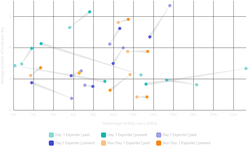
<Chart {...chartProps}>
  {...chartComponents}
  <Scatter
    color="segment"
    dimension="dauPercent"
    lineType="period"
    lineWidth={{
      value: 1,
    }}
    metric="countAvg"
    opacity="period"
  >
    {...scatterChildren}
    <ScatterPath groupBy={['event', 'segment']} opacity={0.2} pathWidth="trailSize" />
  </Scatter>
</Chart>
Props
| name | type | default | description |
|---|---|---|---|
| color | ColorValue | 'gray-500' | The color of the path. Can be a css color value or a spectrum color name. |
| groupBy | string[] | – | List of keys that defines what data must be in common to draw a connecting path. For example, if groupBy={['weightClass', 'type']} then each point with the same weight class and type will have a path drawn connecting them. |
| pathWidth | string | {value: PathWidth | number} | {value: 'M'} | The width of the path. If a string is provided, this string is the key in the data. Each value for this key in the provided data will map to a width from the path width scale. If an object with a value is provided, this will set the width for all paths. |
| opacity | number | 0.5 | The fill opacity of the path. |