Bar (S2)
The Bar component in the S2 package supports nearly all props from the base Bar component plus S2-exclusive features: inline direct labels and Spectrum 2 styled visuals.
The S2 Bar component does not yet support Trendline as a child component.
See Keyboard Navigation for the accessibleNavigation chart prop, currently supported only for Bar.
import { Chart, Axis, Bar } from '@spectrum-charts/react-spectrum-charts-s2';
Bar direct labels (BarDirectLabel)
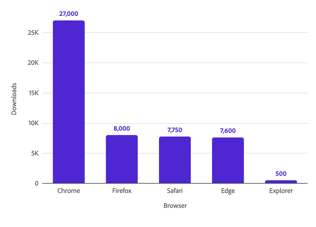
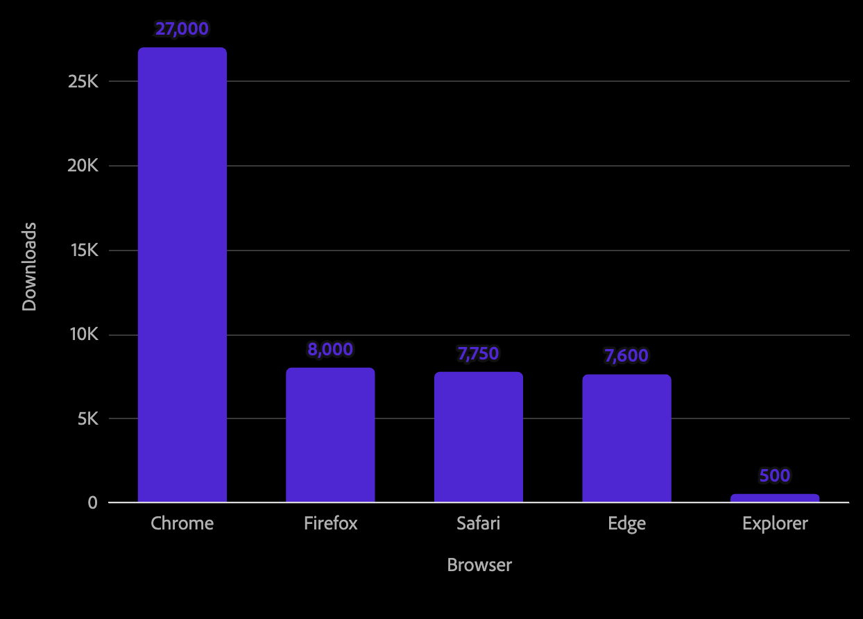
The BarDirectLabel component is an S2-exclusive child of Bar. It places a numeric label on each bar, reading directly from the metric value. By default, labels sit outside the bar tip — above or below the bar for vertical charts, left or right for horizontal charts — and flip to the opposite side for negative values. Labels follow each bar in dodged and stacked layouts.
Labels never overlap other labels or bars. Outside labels that would collide are hidden, and inside labels that do not fit within their bar are hidden (or moved outside with overflow="spill"). Hidden values remain available through tooltips.
<Chart data={data}>
  <Axis position="bottom" baseline title="Browser" />
  <Axis position="left" grid title="Downloads" />
  <Bar dimension="browser" metric="downloads">
    <BarDirectLabel />
  </Bar>
</Chart>
Horizontal bars
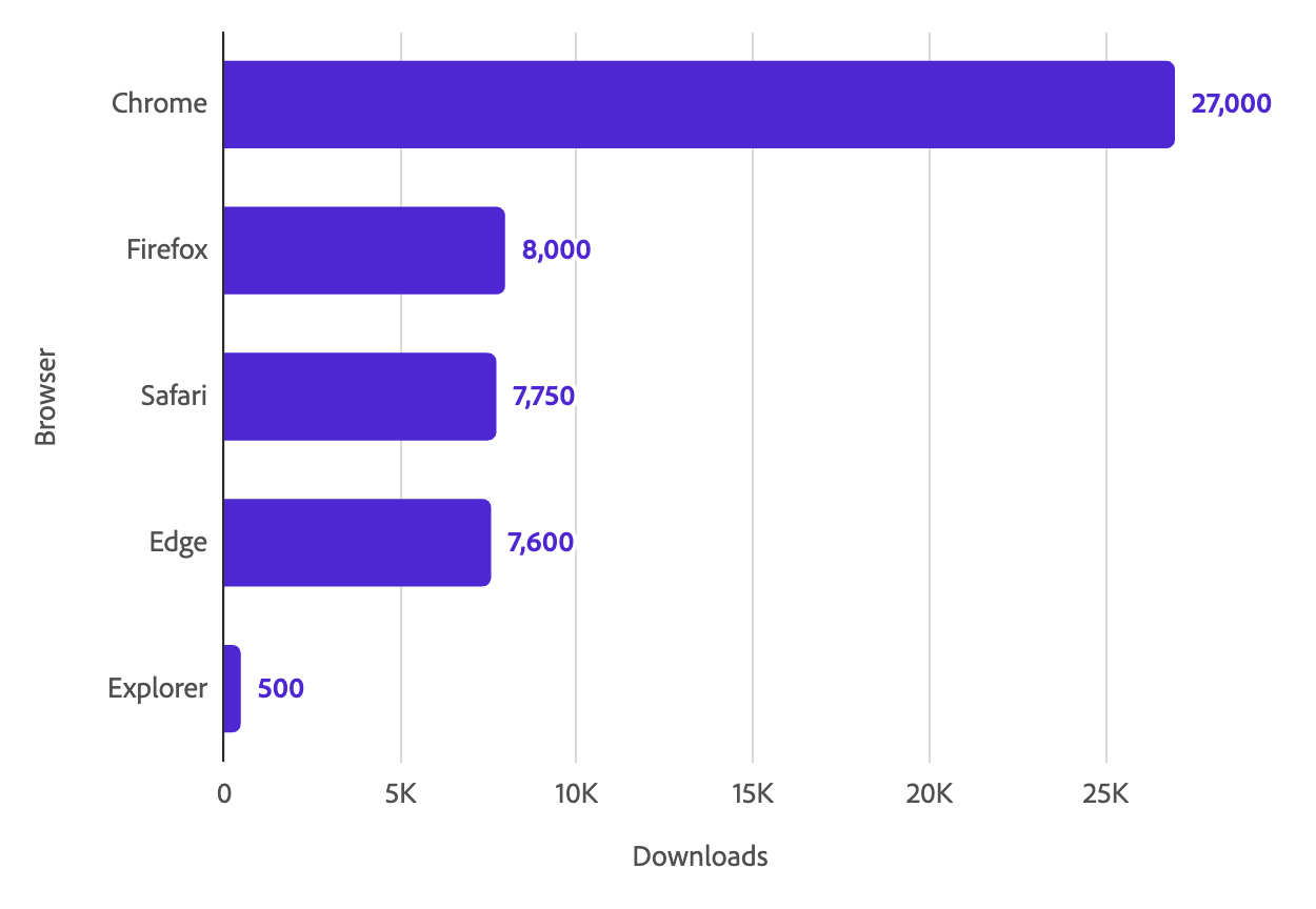
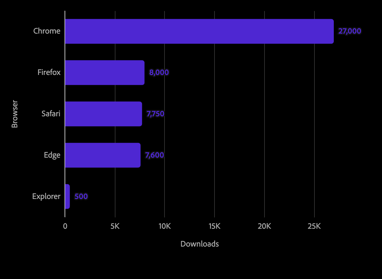
The same component works for horizontal bar charts. Labels appear to the right of positive bars and to the left of negative bars.
<Chart data={data}>
  <Axis position="left" baseline title="Browser" />
  <Axis position="bottom" grid title="Downloads" />
  <Bar dimension="browser" metric="downloads" orientation="horizontal">
    <BarDirectLabel />
  </Bar>
</Chart>
Labeling specific bars
Set dataKey to a boolean field in your data to label only the rows where that field is truthy. These labels follow the same fit and collision rules as other labels.
const data = [
  { channel: 'Email', subscribers: 12600, callout: false },
  { channel: 'Social', subscribers: 6200, callout: true },
];

<Bar dimension="channel" metric="subscribers">
  <BarDirectLabel dataKey="callout" />
</Bar>;
BarDirectLabel props
The label text is derived automatically from the parent Bar's metric, dimension, and orientation.
| name | type | default | description |
|---|---|---|---|
| position | 'start' | 'middle' | 'end' | 'end-outside' | 'end-outside' | Where to place the label relative to the bar. 'end-outside' places it outside the bar tip; 'end' places it inside the bar, 8px from the tip; 'middle' centers it within the bar; 'start' places it inside the bar, 8px from the baseline edge. |
| format | 'currency' | 'shortCurrency' | 'shortNumber' | 'standardNumber' | 'percentage' | string | ',.2~f' | Number format for the label value. Accepts a named preset or a custom d3-format specifier string (e.g. '.1f'). |
| overflow | 'hide' | 'spill' | 'spill' for 'start', otherwise 'hide' | What happens to an inside label ('start', 'middle', 'end') that does not fit in its bar. 'hide' hides it; 'spill' moves it outside the bar tip, where it is hidden if it would collide with another label or bar. |
| dataKey | string | – | Boolean data field. Only rows where it is truthy are labeled. |
Diverging bars
Set diverging on Bar for a metric that spans positive and negative values (e.g. percent change). It moves the categorical axis to the zero baseline and flips each axis label to the side opposite its bar, so labels never overlap the bars.
<Chart data={data}>
  <Axis position="left" baseline />
  <Axis position="bottom" grid labelFormat="percentage" />
  <Bar dimension="channel" metric="changeRate" orientation="horizontal" diverging>
    <BarDirectLabel position="start" format="percentage" />
  </Bar>
</Chart>
diverging only supports a single-series bar (no color, lineType, or opacity facet, and not type="dodged") that is the only bar mark on the chart. It is also a no-op on a trellised chart or when the axis has subLabels. In any of these cases the axis stays at its normal position and diverging has no effect.
Draw-in animation
Add 'drawIn' to the chart's animationTypes to grow the bars from the baseline over 700ms with the
Spectrum 2 ease-in-out curve. Stacked segments fill in order from the baseline outward. Direct labels and
annotations start a 150ms linear fade as soon as their own bar or segment finishes drawing.
<Chart data={data} animationTypes={['hover', 'drawIn']}>
  <Bar dimension="browser" metric="downloads" />
</Chart>
Draw-in is off by default. animations={false} disables it even when 'drawIn' is listed. When a chart
draws in more than one mark type, every mark uses the longest duration so they finish together. When the
user prefers reduced motion, draw-in is skipped and hover fades still run.
Bar props (S2)
| name | type | default | description |
|---|---|---|---|
| children | ChartInspect | ChartPopover | BarAnnotation | BarDirectLabel | – | Optional child components for tooltips, popovers, annotations, and inline direct labels. |
| color | string | {value: string} | 'categorical-100' | Key in the data used to map each series to a color, or a fixed color value object. |
| dimension | string | 'category' | Key in the data used for the categorical axis. |
| diverging | boolean | – | Moves the categorical axis to the zero baseline and flips each label to the opposite side of its bar. Single-series bars only — see the note above. |
| metric | string | 'value' | Key in the data used for the metric axis value. |
| name | string | 'bar0' | Name of the bar component. Useful when referencing a specific bar programmatically. |
| onClick | (datum: Datum) => void | – | Callback fired when a bar is clicked. |
| orientation | 'vertical' | 'horizontal' | 'vertical' | Controls whether bars extend vertically (default) or horizontally. |
| type | 'stacked' | 'dodged' | 'stacked' | Controls whether multi-series bars are stacked on top of each other or placed side by side. |